Mint’s Graphs Show Me Exactly When I Started Cutting Back on My Spending
So when I was looking at my grocery spending earlier this week, I had Mint create one of those bar graphs where I can see monthly spending side-by-side:
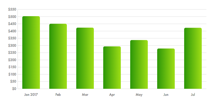
And it’s like yeah, I can see exactly when I started trying to save money. (The higher bar in July, as you might remember, came from throwing a party and stocking up on on-sale groceries through a deals app.)
Then I ran the graph on everything I’ve spent this year:
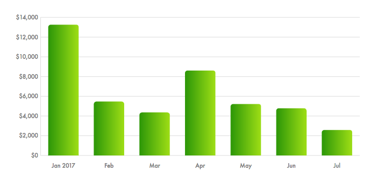
Keep in mind that this spending includes taxes, which… well, let’s run the graph on that:
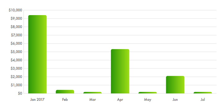
Is there a way to show all of my non-tax spending? Because I bet I can predict what that graph will look like:
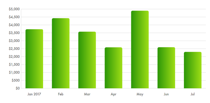
Yeah, that’s about what I was expecting. A significant drop in spending in April, June and July to compensate for the big outflow of money in May when I published my novel and planned a trip to NYC to hang out with The Billfold/Awl/Hairpin and Lifehacker.
What if I pull all of the publication and business expenses out and just look at personal expenses?
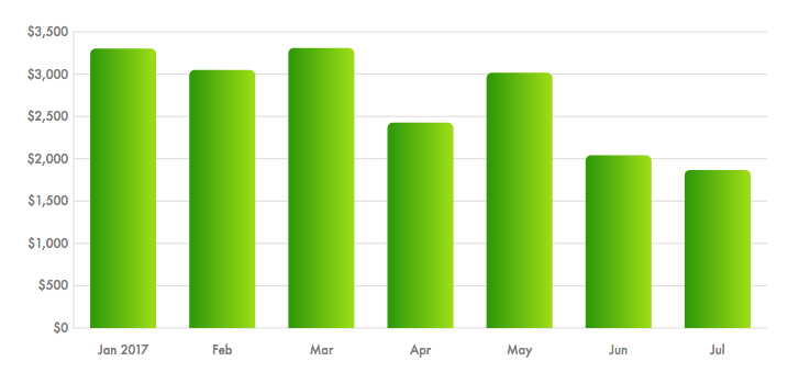
There’s still a bit of a bump in May, but that’s because I was booking plane tickets to see my family in June and my friends in August. It’s also interesting to see the personal spending drop in June and July as I tried to keep to my summer budget—which, as you might remember, I’ve still overspent.
But I have been trying to spend less money this summer, and it shows.
Now, let’s take a look at my earnings:
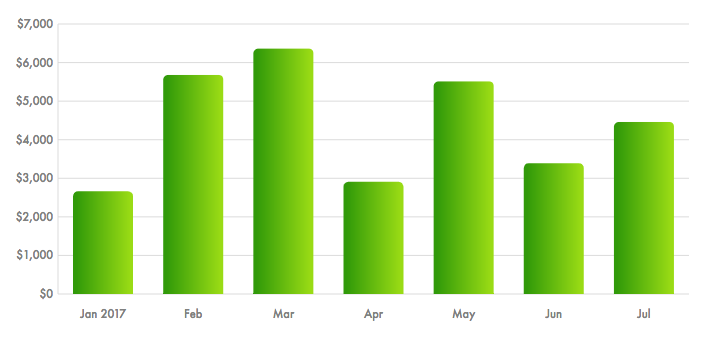
That July earnings bar should be higher than the March bar by the time the month is over, since I’m still waiting on one really big check. The August bar should stretch even higher, assuming I get all of the checks I’m expecting.
Which means maybe, in a month or two, I can start putting a little more money into the spending bars again.
Support The Billfold
The Billfold continues to exist thanks to support from our readers. Help us continue to do our work by making a monthly pledge on Patreon or a one-time-only contribution through PayPal.
Comments